Service Page Proof Architecture: Where Evidence Lives in the Layout
A testimonial band at the bottom of a service page is proof in the wrong place. Put evidence within one scroll of the claim it supports, in five positions, and keep a proof inventory so the page never leans on adjectives.
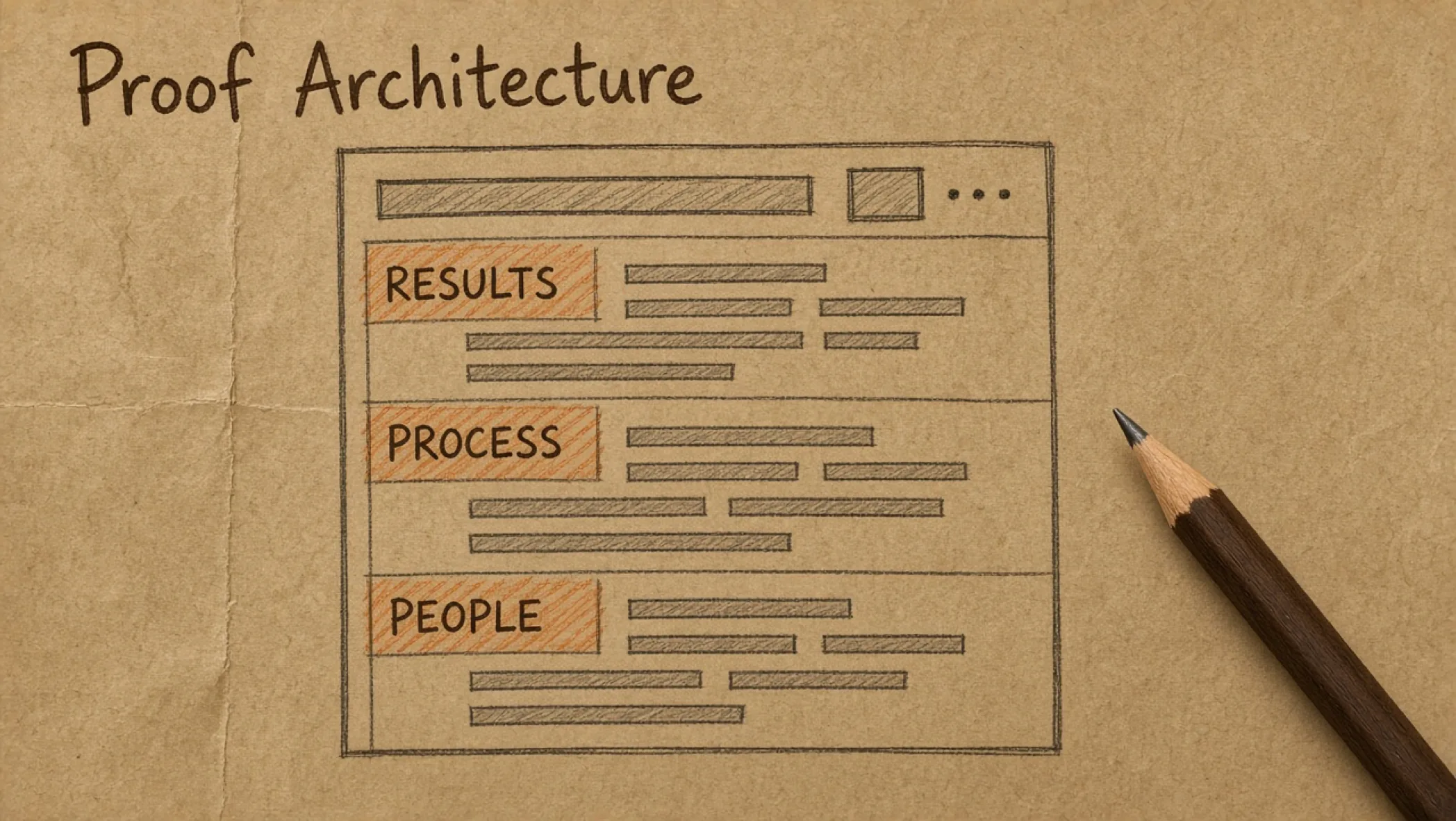
You wrote the service page. The headline makes a promise. Four screens later there is a row of testimonials. In between, the reader has had to take your word for it. A reader who stops scrolling early never sees the testimonials, and one who does cannot tell which claim each quote was supposed to support.
Proof works when it sits next to the thing it supports. That is a layout problem. This builds on the landing page brief, where you picked the proof. Here is where it goes. How to store it so it cannot drift is a claim-and-proof content model.
The rule: one scroll
Framework. Every claim on a service page should have its proof within one scroll of the claim, on desktop and on a phone. Not in a different section, not behind a tab, not at the bottom. If a reader has to hold a claim in their head for three screens, it has already faded.
This does not mean every sentence needs a footnote. It means the promises that matter, the ones a buyer will quote back to a colleague, are never left standing alone.
Five proof positions
Each position on the page has a job, from the line under the headline to the moment before the call to action (CTA). Match the evidence to the job and the page starts to feel steady instead of pushy.
flowchart TD
        A["1. Credibility line"] --> B["2. Inline evidence"]
        B --> C["3. Deliverables"]
        C --> D["4. Limits"]
D --> E["5. Risk reducer"]| Position | Job | Good evidence | Avoid |
|---|---|---|---|
| 1. Under the headline | Say who this is for and that you have done it | One line: type of client served, years doing this specific work, a named artifact you can link to | Logo wall with no context; "trusted by hundreds" |
| 2. Beside each claim | Back the specific promise | A sentence of detail, a sample, a permissioned fact, a short quote tied to that claim | A generic quote that could sit on any page |
| 3. In the process | Show what they get and when | Named deliverables, an example page or document, steps with outputs | Adjectives instead of artifacts ("seamless," "tailored") |
| 4. At the objection | Answer the hesitation honestly | Scope limits, what is excluded, how changes are handled, what you will not do | Hiding limits in the footer or the contract |
| 5. Before the CTA | Lower the risk of the next step | What happens after they click, who replies, how soon, what it costs to talk | A fresh claim introduced right before the button |
Position 1: the credibility line
Right under the headline, one line. It answers "has this person done this before?" without making the reader hunt. A good line is specific: "We have built marketing sites for professional service firms" is checkable. "Industry-leading digital agency" is not.
Position 2: inline evidence
This is where most pages under-deliver. Under each major claim, add one piece of evidence in the same block. It can be a short description of the work, a small sample, or a quote that talks about that exact point. If the evidence belongs to a different claim, move it.
Position 3: the process as proof
When you do not have a result you are allowed to publish, the process is honest proof. List what the client receives at each step and what it looks like. A reader who can picture the deliverable trusts the plan more than a reader who is told it is "bespoke."
Position 4: limits are evidence
Saying what the service does not cover is one of the strongest signals on the page. It shows you have scoped this before. Put it where the objection forms, not in small print.
Position 5: the risk reducer
The last thing a reader sees before the CTA should make the step feel small. Say what happens next, who replies, and by when. Do not introduce a new claim here. New claims need their own proof.
Build a proof inventory first
Before you place anything, list what you actually have. Most teams discover the inventory is smaller than the page they imagined, and that is fine. The inventory keeps the page honest.
| Proof item | Type | Can we show it? | What it supports |
|---|---|---|---|
| Live site we built and still maintain | Artifact link | Yes, with client approval noted | Process claim: scoped, launched, maintained |
| Sample page map from a past brief (details removed) | Permissioned fact | Yes, if permission is written | Claim about planning before design |
| Written change-order rule | Process description | Yes | Scope clarity |
| Client quote | Quote | Only if unedited and permission dated | The specific point the quote speaks to |
| Result figure | Permissioned fact | Only with scope and date, and only if measured | Nothing beyond that engagement |
The first column is hypothetical, built to show the shape of an inventory. Fill yours with real items. If a row says "figure" and you cannot say who measured it and when, delete the row.
A hypothetical annotated page
Hypothetical. A freelance developer sells a fixed-scope maintenance plan. The page order and the proof at each position might look like this.
- Headline: "Website maintenance with a written scope and a named person who replies."
- Under the headline: "Maintaining marketing sites for small service firms." (Describes the work, checkable.)
- Claim: "We back up and update on a schedule." Beside it: the actual schedule as a table and a link to a sample monthly report with client details removed.
- Claim: "Issues get a reply in one working day." Beside it: the stated reply window, and what counts as an issue versus a change request.
- Process: three steps, each with the deliverable listed.
- Objection: "What if we need more than the plan covers?" Answer: the change-order rule, in plain language, plus what is explicitly excluded.
- Before the CTA: "Send your site address. A person replies within one working day with a scoped quote."
There is no testimonial, no logo, and no invented number, and the page still has proof at every claim. When a real quote arrives, it joins position 2, beside the claim it speaks to.
On a phone, the same order
- Keep the order: the one-scroll rule is easier to break on a narrow screen because blocks stack. Check that each claim and its proof are still adjacent.
- No auto-advancing carousels for proof: the reader sees one slide, if that. Show the strongest item as plain text and link to the rest.
- Do not hide proof behind tabs by default: if it matters to the decision, it is on the page, not behind a tap.
- Watch the weight: a proof image above the fold can become the Largest Contentful Paint (LCP) element. Check it in your performance tool, and keep the first screen light.
Review stars and structured data
Sourced. Google’s review snippet documentation lists Local business and Organization as supported types only for sites that capture reviews about other local businesses or organizations, and points to its guidelines about self-serving reviews (Review snippet structured data, checked 1 October 2026). If you plan to mark up testimonials about your own company, read that guidance first. Google’s general structured data guidelines also say not to mark up content that is not visible to readers of the page, and not to mark up fake reviews (checked 1 October 2026). This post does not make a claim about what will or will not show in search results.
Common failure modes
| Failure | What the reader sees | Fix |
|---|---|---|
| Testimonial band at the bottom | Claims with no support for four screens | Move each quote beside the claim it speaks to |
| Logo wall with no context | Names, but no idea what you did | Pair each logo with one line about the work, or remove |
| Same quote used on every page | Proof that does not match the page’s promise | One quote per claim; reuse only where it fits |
| Invented numbers | A figure that cannot survive a follow-up question | Remove it. Use a process description or a sample |
| Limits hidden in the contract | A surprise after the call | Put exclusions at position 4, in plain words |
Using the proof map
Print the service page proof map and fill one for the page you plan to rework. List every claim, then the position and proof for each. Any row with no proof is a claim to rewrite or remove. Decide the information architecture (IA) of the page first, then fill the map. The website brief template covers the wider site.
If you want a service page built this way, that is part of our website work, and the wording work behind it is branding. Or send us the page and we will mark where the claims have no support.
Frequently asked questions
What is proof architecture?
Deciding which evidence goes where on a page, so each claim has support within a short scroll and the page does not rely on one testimonial section at the bottom. It is a layout decision, a content decision, and a permission decision at once.
How much proof does a service page need?
Framework: enough that every claim in the first two screens has something next to it, and the main objection has a straight answer. That can be a single permissioned fact and a clear description of your process. Volume is not the test. Placement and honesty are.
What if we have no client names we can show?
Use what you can stand behind: a description of the work with details removed (with permission), your own process, a sample deliverable, a public artifact such as a live site you built and own, or your own site as the case. Do not invent names, logos, or round-number results. A page with less proof and no inventions reads better than a page with a lot of it that falls apart on a call.
Should I add review stars with structured data?
Be careful. Google’s review snippet documentation lists Local business and Organization as supported only for sites that capture reviews about other businesses, and points to guidelines about self-serving reviews. Reviews you collect and display about your own company are the case to read those guidelines for before adding markup.
Do logo walls count as proof?
A logo says "this company was associated with us." It does not say what you did. Use logos only with permission, and pair them with a sentence about the work. A wall of logos with no context is the weakest proof position on the page.